Shapes
To bring assets on the map you need to be a DM, see the DM asset docs.
Manipulating Objects
Selecting/interacting with objects is primarily done through the select tool.
When the shape is selected, you may also use your arrow keys to move it.
Context menu
Right clicking on a shape will give you a list of options. The options presented will be different depending on whether you are a DM or not, but also on the state of the token (e.g. Add vs Show initiative).
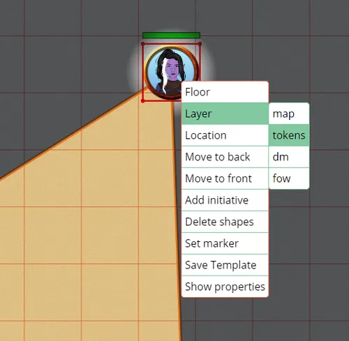
The list presented above is the DM view.
(DM) Floor/Layer/Location
Hovering over the Floor/Layer/Location options, will open a submenu allowing you to move the selected shape to the selected option.
Moving the shape to a different floor or layer will keep it in the same coordinates. When moving the shape to a different location however, you need to choose the desired spawn location where the shape should appear.
For more information, check the floors, layers or locations documents.
Move to Front & Move to Back
These options place your shape at either the front or the back of the active layer stack. This allows you to place multiple objects on the same layer but have them overlap in specific ways.
Add initiative or Show initiative
This option places tokens in the initiative menu. If already in the initiative menu, this will appear as “show initiative”. For more information, check the initiative document.
Delete shapes
This option deletes the selected shape(s).
You may also press Del or Backspace to do this.
If you accidentally remove a shape, you can undo it by using the ctrl+z keybinding. This also works for certain other operations like movement.
Set marker
This option sets the shape as a marker. See markers for more information.
(DM) Save template
When saving a shape as a template you store the current information on that shape (e.g. size, trackers, …) on the server.
When dragging an asset on the board with templates, you’ll be able to select your stored information to pre-populate it.
For more information see Asset Templates
Show properties
This option opens the “Edit asset” dialog, described below.
Shape properties
By right clicking and selecting the “Show properties” option, you open the “Edit asset” dialog, which allows you to modify various settings related to the selected shape.
Properties
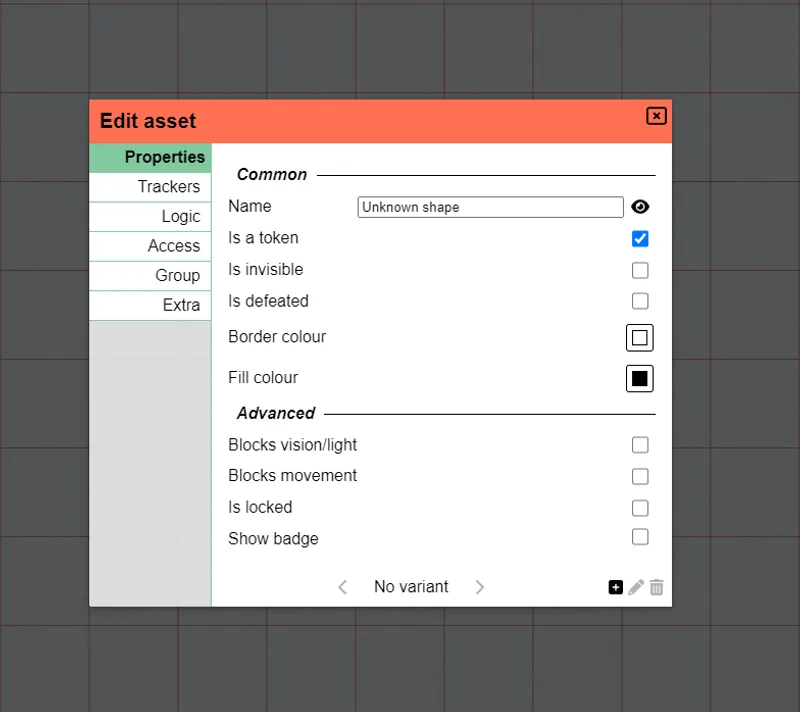
The first section consists of common properties related to the selected shape.
Name
The name of the shape, this is an optional field that defaults to ‘Unknown shape’. This name will show up in some other places like the quick selection info and the initiative list.
The symbol is used to toggle whether other players without edit access are allowed to see this name. If this is not allowed, other players will see ‘Unknown shape’ irregardles of whether the name was set.
Is invisible
Selecting this option turns the shape invisible to all players without vision or edit access to the shape (*).
Example uses for this feature are invisible summons that a player controls.
There is currently no visual indicator on the board to remember that a shape is currently invisible.
(*) The DM will also see invisible shapes as they have implicit edit access to all shapes
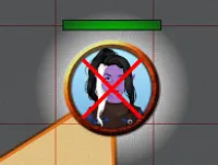
Is defeated
When checked, this will display a simple, red x over the shape to indicate it is defeated.
This property can also be toggled by pressing x.
Border colour & Fill colour
As the names suggest, these options affect the colours of the shape.
Note that for some specific shape types only one of the two colours is used.
Blocks vision/light
Selecting this option blocks vision and light from passing through the shape. More information about lighting can be found in the lighting and vision document.
Example uses are walls/doors/…
For performance reasons you typically don’t want to assign this property to shapes that regularly move.
Blocks movement
Selecting this option prevents other shapes from moving through it.
This is commonly paired together with blocks vision for walls, but can also be used alone for things like windows.
As a DM you can circumvent this restraint by using the shift modifier while you move shapes.
For performance reasons you typically don’t want to assign this property to shapes that regularly move.
Is locked
Selecting this option locks the shape in place. This can be useful for static shapes you don’t want to accidently move while playing. Especially useful for your maps which might otherwise take you some time to grid align again.
Press Ctrl + L to do this without opening the Edit asset menu.
Show badge
Selecting this option displays a badge at the bottom right of the shape. By default, the badge number is 1. As you copy and paste this shape, the badge number will increase incrementally.
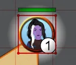
This option is key for situations where you have large groups of similar tokens. If all creatures have the same icon, it can be difficult to differentiate between them during combat. Enabling this option ensures the players and the DM are talking about the same shapes.
You can configure the details of how the badge values are generated in the Group section.
Trackers & Auras
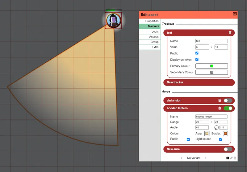
Trackers
Trackers can be used to keep track of various states. Common usages are for example HP, NPC attitude or arrows/ammunition usage.
A tracker consists of a value and optionally a name and a secondary value. The second value can be used to denote a maximum (e.g. HP 20/40).
Trackers are created by clicking New Tracker and filling in some value.
A tracker that is set to be public will be shown for everyone who selects the shape.
Otherwise, only players with edit access to the token will be able to see it.
Activating display on token will show a horizontal bar on top of the token.
It can be configured with two colours, the primary colour showing the first value to the left of the bar, the secondary showing the second value to the right of the bar.
The bar follows the public setting to determine its visibility.
Clicking the tracker’s title bar will collapse the tracker to reduce clutter. A tracker will be removed by clicking the trash icon on the title bar’s right.
Auras
Auras are similar to trackers, but have a visual impact on the board.
Range
To draw an aura on the board you need to specify its range. This concept consists of two values. The “normal” part and the “dim” part.
The normal value will be used to draw a circle with the provided radius at full opacity, whereas the dim part will be used to draw an additional radius that will drop down in opacity towards the edge.
For example, In dnd 5e a torch is defined as 20ft bright and 20ft dim light, so here one would fill in 20/20 as well.
The numbers filled in are directly related to the way the DM configured the grid. This defaults to 5ft = 1 grid, so a value of 20 would translate to an aura that covers 4 squares (radius).
Angle
This is a niche feature that can be used when you don’t want the aura to cover a full circle, but rather want a cone.
The first value dictates the width of the cone angle and defaults to 360 (i.e. a full circle). The second value, set by dragging the knob on the circle or by changing the text field, dictates the direction the cone should look to. For a full circle this value is ignored for obvious reasons.
The direction is relative to the rotation of the shape. So if you rotate your shape, the cone will rotate along!
Colour & Border
Every aura can have two distinct colours (including transparency settings).
These will be drawn on the game board if the aura is active.
The colour set for aura will affect the area covered by the aura.
Independently, a colour for the aura’s border can be set.
Use angles and colours to indicate lights worn by the character and borders to indicate reach of spells centered on you, e.g. detect magic or invisibility purge. You can also use this to remind yourself of special attack reach etc.
Public
By default any shape or aura is only visible to the DM and any player that has edit access to the shape.
Sometimes however you want to show auras to all players, that’s when you make the aura public.
You would enable this setting for a torch, but disable it for darkvision for example.
Light source
This small toggle has a lot of impact on the aura and is something that makes the vision system in PA so nice!
By default auras will just render on the board irregardless of walls or other obstacles and won’t give you vision. This is perfect for things like paladin auras and the likes.
By toggling the ‘light source’ option, you signal to PA that this is no normal aura but is actually a source of light/vision. If there are walls in the way the aura will stop at the borders and not reveal anything behind it. Additionally it will actually reveal everything in the aura to the player (and all other players if it’s a public light source).
Common uses are darkvision, which is a private light source and a torch which is a public light source.
Note: vision and lighting are typically only relevant when you use the line of sight vision system
Logic
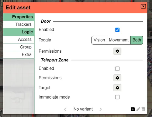
This section allows you to add some extra logic to the shape. Currently two types of logic exist: “doors” and “teleport zones”.
Doors
A shape with door-logic will have a or icon when you hover over them in play-mode. Clicking when this is shown then opens or closes the door.
By default both the vision and movement properties will be toggled to mimick a door, but you can alter this to for example only toggle the vision to mimick a window.
You can alter who can open/close the “door” in the permissions section.
Teleport Zones
A shape marked as a tp zone can teleport shapes that enter it to a different place. The target of a tp zone is always a spawn location and can be on another floor or even location.
TP Zones come in two flavours that can be controlled with the “immediate mode” setting. In immediate mode the tp zone will automatically fire when a shape ends its movement on the zone. (e.g. a trap that fires) Otherwise a notification will be shown that allows you to trigger the zone if you desire. (e.g. the landing of a staircase)
Access
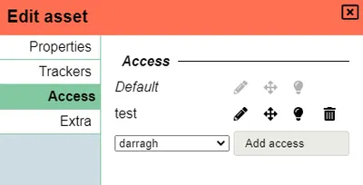
Player access to the shape can be configured in this section. By default the creator of the shape has full access right to the shape as well as the DM.
You can modify the default access or set specific access rights for a player using the dropdown.
There are 3 different access levels and they can be enabled/disabled individually.
Edit access
When given, this allows the user to modify the properties of the shape. This includes all other settings like trackers and access itself.
Movement access
Allows the user to move the shape around on the map.
It’s important to realize that when this access right is given without vision rights, it’s possible for the player to move their shape into the fog and lose it.
Vision access
When given, provides the user with vision access to the private auras on the shape.
This is an important setting for Line of Sight based vision.
Some access combinations
When all access rights are given, you simply have full ownership of a shape. This is commonly used for player characters.
As mentioned in the movement access, it’s possible for you to have movement access without vision access.
An example of a reason why you might want this are summons/pets/companions.
Basically any shape that you own to a certain extent, but don’t actually have full vision rights to.
(e.g. Usually you don’t see what happens if you send these behind the corner, though special spells or features might change this)
Another class of shapes that you shouldn’t really have vision access over are the shapes created with the draw tool. These tend to represent objects like walls etc. When drawn they explicitly don’t grant you the vision access right by default, though you can of course enable it when relevant.
Group
Groups are a way to organize shapes with an optional badge to differentiate them (e.g. ogre 5). Within a group each shape has a unique* value, its badge.
* when merging groups you have the option to retain original badge values, which could lead to duplicate badges
Group options are configured in this UI menu. It shows the rules in place, the existing members in the active location and you’re able to toggle/remove individual members or toggle the entire group at once.
Outside of this dialog, there is also a context menu when right clicking with a selection that contains multiple elements. This context menu provides options to create/merge/split/remove groups as well.
By default when copy-pasting shapes, shapes are put in the same group.
Character set
By default badges consist of numbers, but other characters may be preferred,
there are 2 presets (numbers and latin characters), but a custom set of characters can be provided as a , separated list (e.g. α,β,γ,δ,ε,ζ,η,θ,ι,κ,λ,μ,ν,ξ,ο,π,ρ,ς,τ,υ,φ,χ,ψ,ω).
Creation order
By default when adding a new member to the group, it will receive a new number that is 1 higher than the previous highest number in the group. This means that removed numbers are skipped (e.g. if there are 5 orcs and orc 2 dies, and a new orc is created it will receive number 6 and not 2)
Another option available is to randomize numbers. When randomizing, a badge index will be asigned randomly between 0 and 2 times the number of members in the set (with a minimum of 10). The available random space will thus automatically scale upwards without revealing too much for metagamers.
When changing the creation order, all existing shapes will be rebadged (after a confirmation popup).
Groups spread over multiple locations
Yes this can be the case, if a group of monsters chase the party to a different location, they might not all arrive at the same time or even ever all move to the new location.
Although technically possible, tracking over multiple locations is a giant pain with a lot of special cases. For this reason and the fact that actual impact seems slim, simplicity is what PA chooses. When adding a new group member in a group with multiple locations, its badge uniqueness will only be guaranteed within the set of members that share its location. For random creation order the chance of an actual collision is very slim, for incrementing order it depends on which location has the highest value member. Either way the impact this has is so small compared to the extra programming logic that would need to be added that it is a worhtwhile trade-off.
Extra
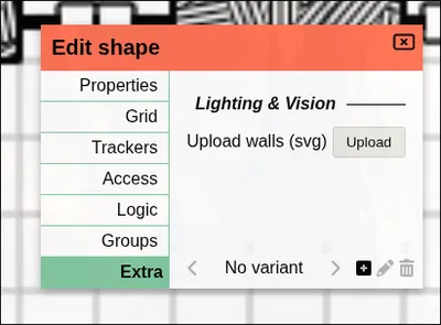
This panel contains some settings that do not fit in any of the other places.